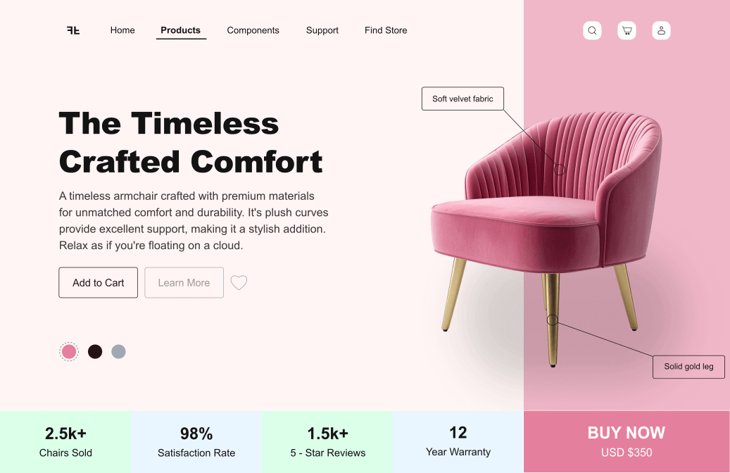
The Timless Crafted Comfort - Armchair UI Concept
×
Project Overview
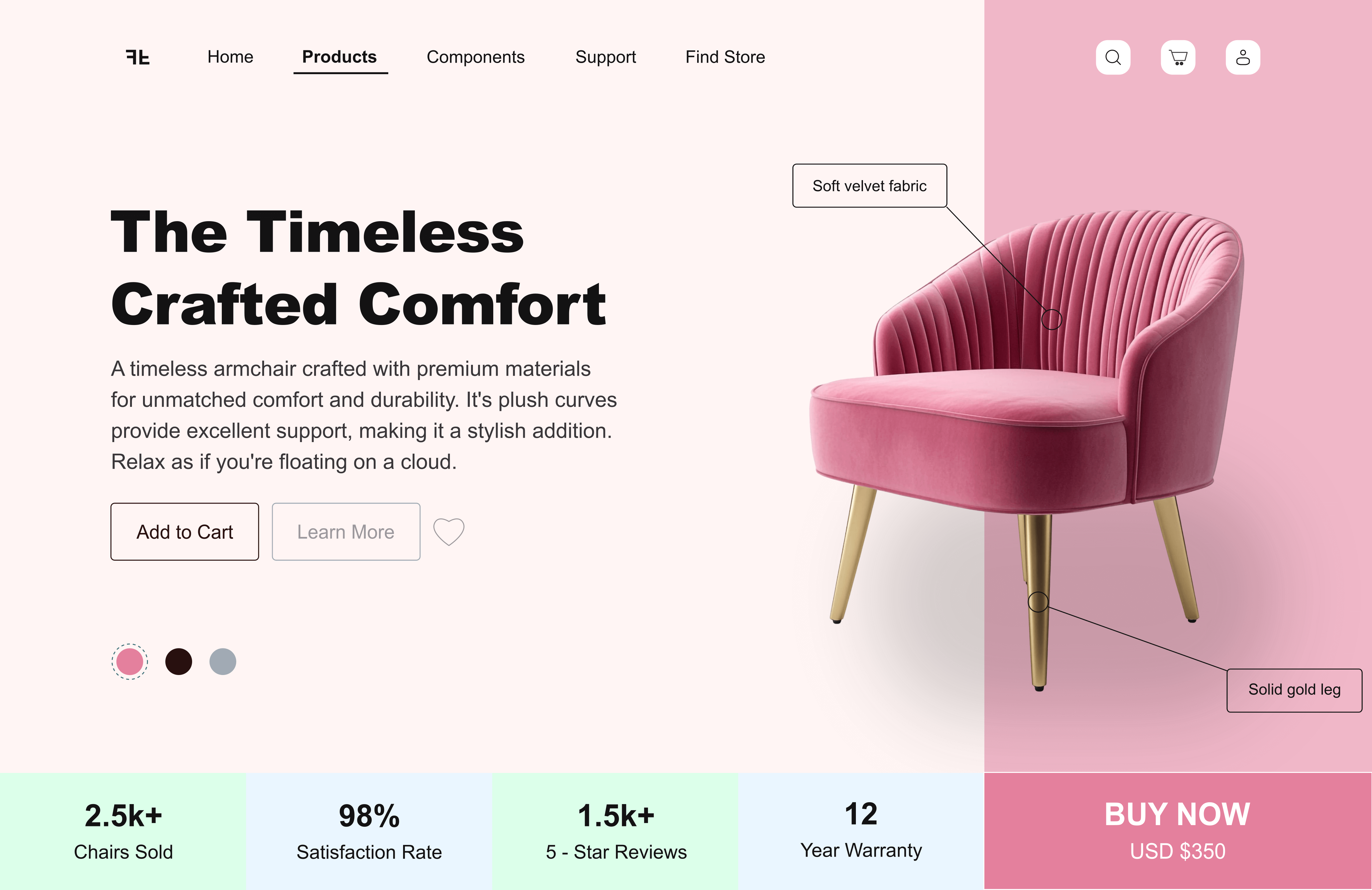
This quick concept is a clean, minimalist product hero I recreated in Inkscape to test how furniture and lifestyle brands present premium products online. It's a single-page focus section designed around one product showing how color balance, copy, and layout hierarchy work together to sell a lifestyle rather than just an item.
Why I made this?
I wanted to see if I could reproduce a high-end furniture store's look inside Inkscape — no Figma, no auto layout, just pure visual structuring. The goal was to match real-world e-commerce presentation standards: soft color transitions, confident typography, and clear product focus without clutter.
What this shows about me?
- I can design clean, market-ready product pages that balance aesthetics with usability.
- I pay attention to real product storytelling showing material quality, pricing, and lifestyle value clearly.
- I understand how e-commerce layouts build trust visually before functionally.
- I can keep visual consistency and brand tone even when replicating existing web patterns.