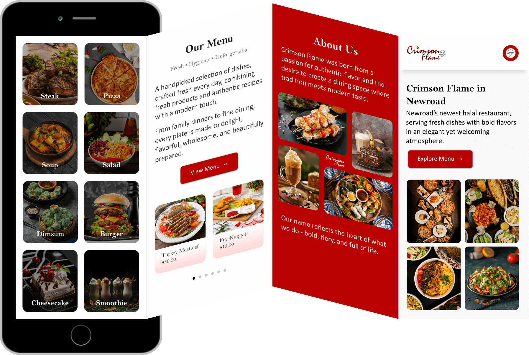
Crimson Flame – Brand Identity & Digital Brochure
×
Project Overview
A tri-fold inspired digital brochure concept, highlighting restaurant story, signature dishes, and brand personality. Designed with a blend of vibrant visuals and structured layout. It's a sophisticated restaurant branding project featuring both mobile app and promotional materials, combining rich crimson red branding with elegant food photography to create a cohesive dining experience that bridges digital convenience with authentic culinary tradition.
Why I made this?
I wanted to explore a branded brochure layout that feels premium but usable — something you could hand to a customer or show as a hero on a restaurant page. The red panel is bold on purpose: it anchors the identity and gives the food imagery room to breathe.
What this shows about me?
- I can create editorial restaurant layouts that feel deliberate and appetizing.
- I care about visual hierarchy, i.e. hero imagery, CTA placement, and brand tone.
- I can work with vector tools to build layout-rich brochure comps that are presentation-ready.