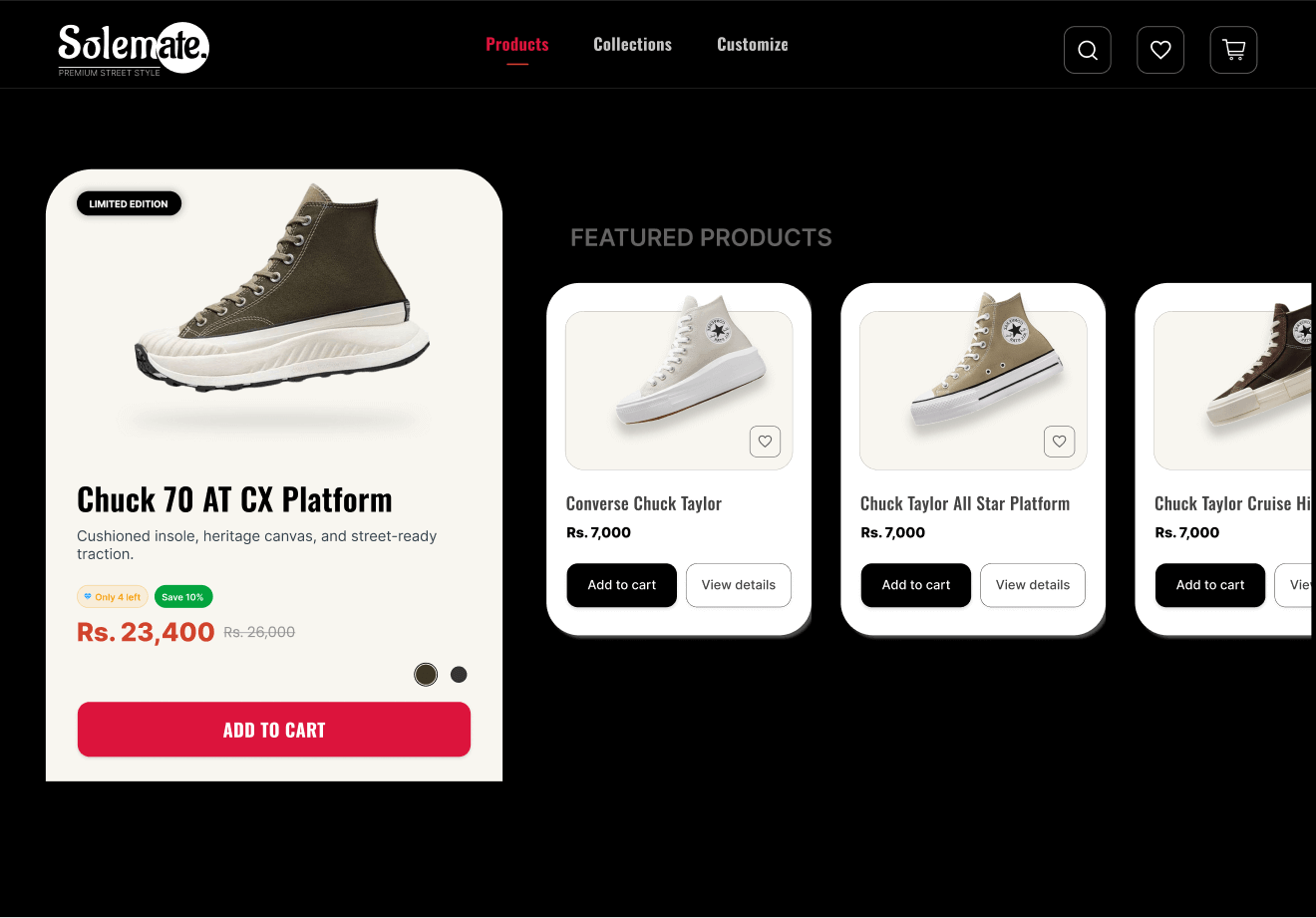
Solemate – Converse Ecommerce Landing Page
×
Project Overview
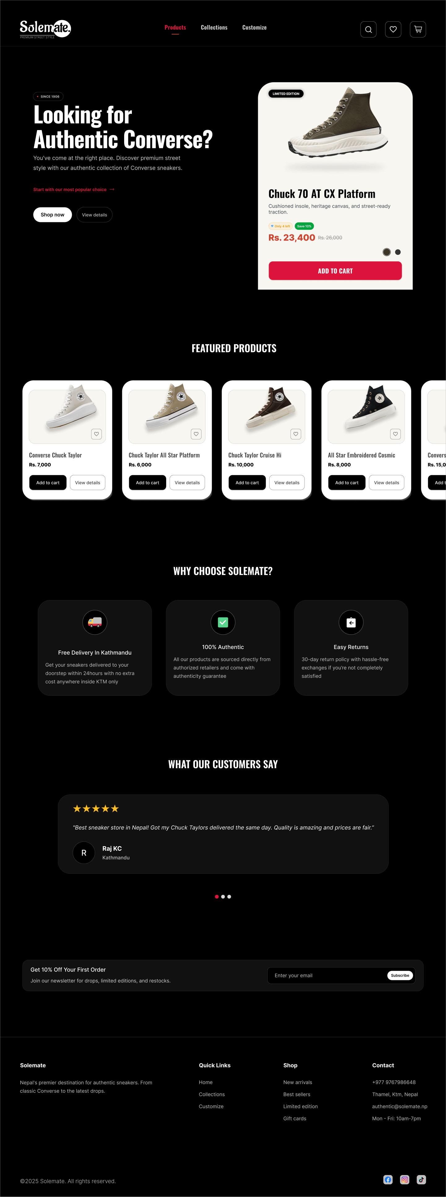
This is a personal challenge I gave myself, designing a clean, premium landing page just for Converse sneakers. It's more of a starter foundation than a complete shopping flow, but I wanted to see how far I could push a simple concept into something that feels conversion-friendly and well thought out.
Key Highlights
- I kicked things off with a hero section that makes a strong first impression, backed by clear CTAs.
- The product grid is simple but functional, product cards with pricing, add-to-cart, and quick details.
- I added a trust section ("Why Choose Solemate?") because credibility is key in ecommerce.
- The testimonial section brings in social proof and builds confidence.
- I closed the flow with a footer section giving users essential links and a sense of completeness.
- Overall, I treated this as a foundation that could later grow into a real shopping experience.
Why I made this?
I've always liked the boldness of Converse branding, so I took it as a quick challenge. No research, no team, just me figuring out how to make a clean, conversion-ready sneaker page from scratch.
More Figma Projects