Context
OnStream has the core features people expect, but when you use it regularly, certain patterns start to stand out, repeated elements, unclear hierarchy, and moments where the app makes you think a little more than it should. Over time, these small things add up and create friction. This redesign focuses on reducing that mental load and tightening the overall experience.
What Changed
- Simplified onboarding by removing duplicate CTAs and giving sign-up a single, clear entry point
- Reduced home navigation to only essential sections and removed overlapping destinations
- Added clear “Ongoing” and “Completed” labels so series status is visible without digging
- Reworked movie/series detail pages to surface key information first and reduce visual noise
Issues Identified
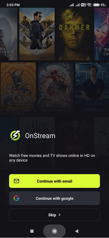
Onboarding duplication and friction
The onboarding flow gave multiple CTAs that all led to the same place. “Continue with email” and “Continue with Google” both dumped you into the same login screen, so you ended up making a decision that didn't actually matter. It added an extra step without a real benefit.
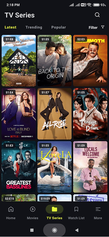
Cluttered home navigation
The home screen was doing too much. Duplicate categories, overlapping content sections, and multiple ways to reach the same pages made the app feel heavier than it needed to be. For a platform built around quick content decisions, this slowed things down unnecessarily.
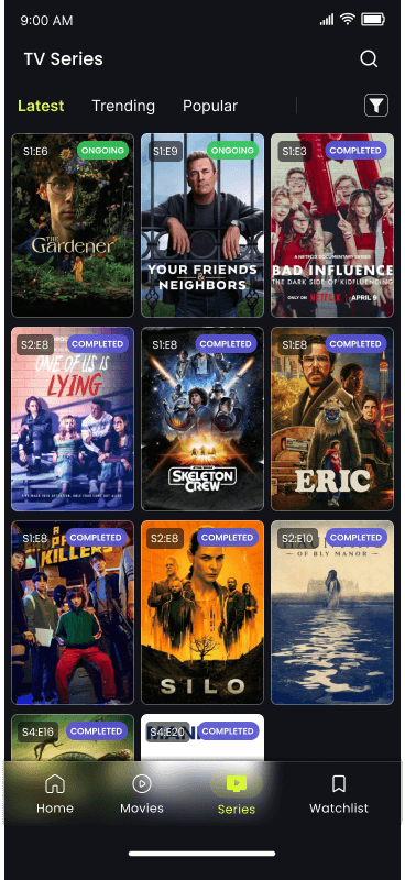
Missing context for series
If you watch a lot of shows, you've probably started something only to later realize it's still ongoing or never finished. OnStream didn't surface series completion anywhere, which meant guessing before starting something new. This missing context directly affects viewing choices.
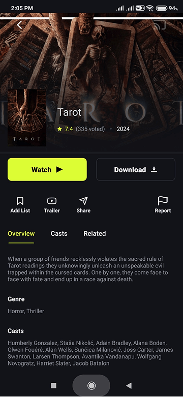
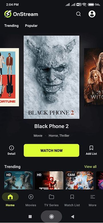
Detail hierarchy issues
When landing on a movie or series page, the first things you usually want are the basics: rating, category, year, runtime, and a short overview. The original layout didn't prioritize this information well, and had repeated context forcing more scanning than necessary.
Design Responses
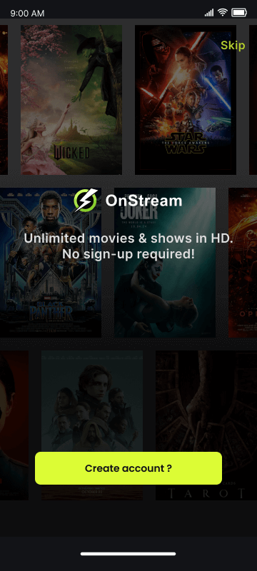
Cleaner, more purposeful onboarding
I removed redundant CTAs and introduced a clearer entry path. “Create Account” is the primary action, with an obvious “Already have an account?” option for returning users. Simple, direct, and no unnecessary decisions upfront. ↑ View issue
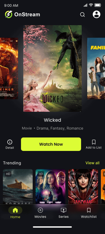
A leaner home navigation
I reduced the navigation to four essential items and removed duplicate sections entirely. This makes it easier to understand where things live and gives the app a cleaner rhythm while browsing. ↑ View issue
Added series completion status
I surfaced “Ongoing” and “Completed” labels directly on the home and series pages. It's a small change, but it helps avoid starting something without knowing whether it actually has an ending. ↑ View issue
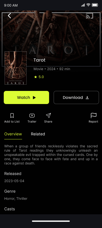
Rebuilt information hierarchy
The detail page now puts the important information where your eyes naturally land first. The layout is cleaner, easier to scan, and doesn't feel overloaded anymore. ↑ View issue
Limits of this Project
Since this was a self-initiated redesign, everything here is shaped by my own experience using OnStream. The decisions are based on what I personally found confusing, repetitive, or unclear — not on formal user interviews or usability testing. With access to a broader user base, I'd want to validate whether others run into the same issues.
The work was done using the free tier of Figma, which limited access to features like advanced prototyping, branching flows, and shared libraries. Because of that, interactions are shown at a conceptual level rather than as fully connected, production-like prototypes.
And since this wasn't tied to an actual business request, I didn't factor in metrics or cross-team priorities the way I would in a production environment.
In short, this redesign addresses real friction I personally experienced, but it remains a concept piece. With user data, technical input, and fewer tooling constraints, these decisions could be further refined and validated.
Reflection
This redesign was less about sweeping changes and more about fixing the small things that get in the way of an otherwise solid experience. Working on a product I actually use made it easy to notice the friction points quickly, and designing with that lived experience helped me stay focused on what actually matters.
If I were to take this further, I'd explore user testing to find whether these changes actually help users find and choose content faster, and dig deeper into alternative navigation patterns; but this version already feels like a big step forward in usability.